Openpath Brand
Established and evolved Openpath's visual identity across every major brand touchpoint
Overview
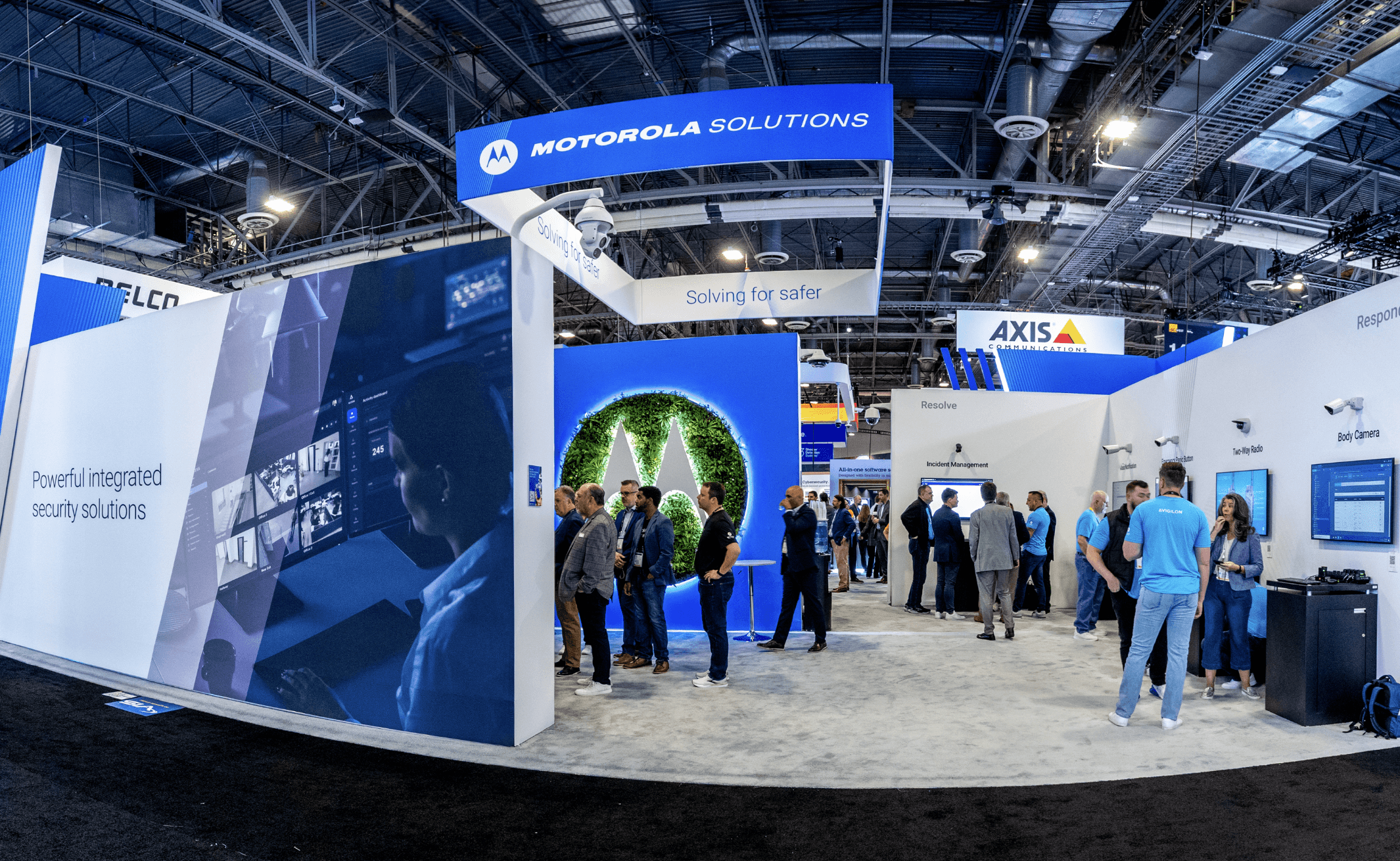
I joined Openpath as one of its first 30 employees and the company’s only designer and Art Director, helping build the brand from the ground up. I shaped its visual identity across print and digital, UI, packaging, merchandise, OOH, trade show environments, video production, and motion graphics, while also building a centralized DAM to support sales enablement and scale creative operations. As the company grew, I helped establish the systems and creative standards that kept the brand cohesive across every touchpoint. Openpath was ultimately acquired by Motorola Solutions for $297 million.
Year
2021
Duration
3 years
Client
Openpath
Categories
Brand Design
Experiential
Video
Digital


Challenge
One of the biggest creative challenges was differentiation. Physical security has historically been dominated by conservative, technical, and often visually dated brands. Openpath was fundamentally different: the technology was modern, beautifully designed, cloud-based, mobile-first, and built around making access feel effortless. The challenge was making the brand look as forward-thinking as the product actually was without sacrificing the credibility and trust required in the security industry. We needed to communicate complex technology and enterprise-level security while still feeling human, intuitive, and aspirational. The resulting brand strategy centered on ideas like “Clearing the path,” “Forward Thinking,” and “Clear, uncluttered, expertise,” positioning Openpath as a modern alternative to the traditional access-control category.


Solution
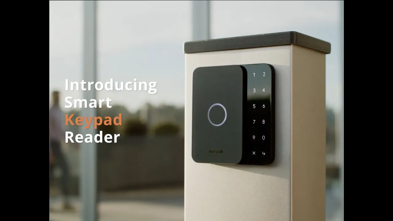
My solution was to use clean, minimal design as a competitive advantage. I leaned into generous white space, strong typographic hierarchy, purposeful grids, bold orange and blue accents, restrained photography, and simple graphic systems to make complicated technology immediately understandable. The brand guidelines formalized this approach around a modern Poppins type system, a distinctive orange/black/blue palette, and a principle that white space should be the first level of hierarchy in print. I also helped translate the brand beyond static marketing into a broader visual language, using the “hardware + human” concept and the Openpath “aura” to visually demonstrate the interaction between people and technology, rather than simply photographing products in isolation. The result was a security brand that felt less like traditional physical security and more like the future of the built environment: confident, sophisticated, approachable, and unmistakably modern.

View More.
Explore how Rachel has helped businesses elevate their brands.